This is something you may do without even realizing why you do it.
Using the right colors will help your customers KNOW, LIKE, and TRUST you.
Having the right color scheme makes customer comfortable and gives them a positive feeling about you and your site.
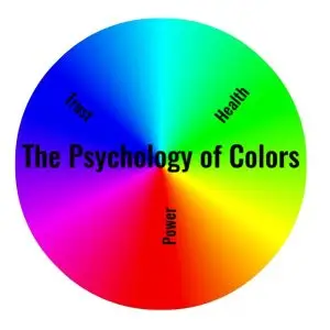
Let’s look at the psychology of colors.
Sporty cars are often red for a reason. Red grabs your attention and creates strong emotion. Red makes you want to take action. Red signifies
With red, you can portray speed, strength, or passion for your business. Red draws intention and is exciting.
Orange grabs your attention. Possibly more than any other color. This is why so much safety equipment is orange; e.g., traffic cones. But happiness and optimism are identified with orange as well like Thanksgiving. Orange signifies
Orange is a fun color. You can use orange to show you like to have fun and are not too serious. But be careful not to use too much orange it can be overpowering and make visitors uncomfortable.
Yellow is bright and sunny. People feel joy, happiness, and positivity from yellow. If you want an attention grabber, bright yellow is your color especially if paired with black for high contrast. Yellow signifies
Yellow tends to be a happy, warm color but has has negative connotations too; e.g., cowardice. Don’t over use bright yellow in particular.
Green makes people think of nature. There is green all around us in nature. Green can also be associated with money. It is the second most popular favorite color.Green signifies
Green works well for health or eco-friendly businesses. It also works well to associate with wealth, a positive thing. On the negative side, it can be associated with envy or sickness.
Blue is the most popular color. People trust blue. Blue make people think of the sky or water. Blue can be used on almost any site because it is considered trustworthy. It is a calming color. Blue signifies
Blue works well if you want to calm those looking at your site or instill trust. Too much blue can make it feel cold and impersonal. Think of a blue logo. Which one popped into your mind.
Was it Facebook?
Purple portrays royalty and wealth. It can portray innovative or bravery like the Purple Heart. Purple signifies
Purple grabs peoples’ attention and may let them escape from reality or envision magical images. Purple denotes high value. Purple can make you stand out.
Does it work for FunnelsPay?
Pink is associated with femininity (no surprise). It is also associated with enthusiasm and creativity. It represents hope and can reduce anger and pain with comforting feelings. Pink signifies
Pink has a calming effect. I have heard that some sports teams use pink in the oppents locker room. Pink can be associated with weakness or not being serious.
Brown is earthy. People associate brown with wholesomeness and warmth. It works great with vintage themes and relates durability, safety, and reliability. Brown signifies
Brown is associated with warm coffee and spices, fallen leaves, and anything organic. If you want to be considered reliable use brown like UPS. Too much brown can become boring.
Black is dramatic and decisive. It is minimalistic. There is no uncertainty or ambiguity with black. it can add a sense of certainty. Black signifies
Black is associated with high-priced brands. It symbolizes high quality and sophistication. Black is minimalistic and combines well with other colors. Too much black can be overpowering and dull.
White is also minimalistic and represents purity. It is associated with cleanliness even sterility like a doctor’s white coat. Use of white creates can create space on a page. White signifies
White can add focus and organization. White can be used to highlight other colors. Too much white can make us feel distant or cold.
What white logo pops into your mind? It’s Nike for me.
If you want to show maturity and authority, gray is your color. Gray shows intellect and can represent compromise since it is between balck and white. Gray signifies
Gray is a serious color. Law firms use a lot of gray to represent wisdom that is gained with experience. Gray can create the feeling of distance or disconnetion.
For what statistics are worth, according to a study by Reboot Online, the most popular branding colors are
✅ 34% of brands used black in their logos
✅ 30% of brands used blue in their logos
✅ 30% of brands used red in their logos
✅ 9% of brands used yellow in their logos
✅ 7% of brands used green in their logos
✅ 6% of brands used grey/silver in their logos
✅ 5% of brands used orange in their logos
✅ 2% of brands used brown in their logos
I am not sure what their criteria were for including a brand but I am surprised purple didn’t make the list.
I hope this gave you some food for thought. Please leave a comment and let me know if you found it helpful.